Recently working on an updated business card I found myself, yet again, whipping up a quick word mark for myself.
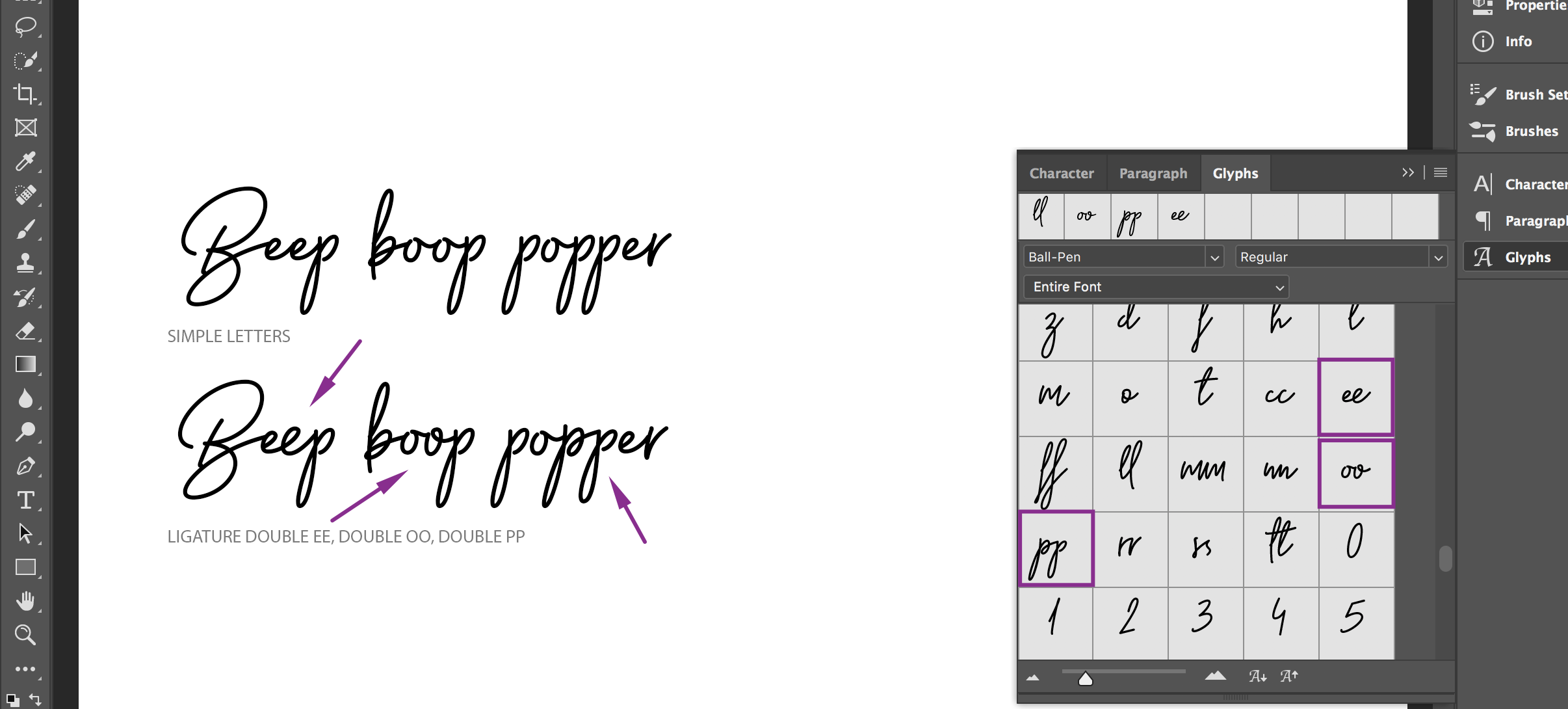
I’d recently seen a post about using the glyphs panel in Photoshop to preview all of the characters available for a decorative font. As I scrolled through the glyphs to see if there were any fun swooshes to add to the tail of the w at the end of my last name, I stumbled across another typographic element I’d long forgotten from my college typography classes: typographic ligatures.

Thoughtful use of typographic ligatures, which are defined as “two or more letters that are joined as a single glyph” really makes a huge difference with these handwritten style fonts. There is a nuanced way for handwritten letters to connect.
Here are a couple other letter examples. Observe how two e’s and two o’s as the same simple letters look fine next to each other but the ligature “ee” and “oo” was an opportunity for the typography designer to add some dimension to the second letter, giving the words a more authentic handwriting feel with the variation.

This font, Ball Pen, is not reflective of all the ligatures that may be available in other fonts. It is entirely up to the person who designed the font to decide what ligatures to support and stylistically.
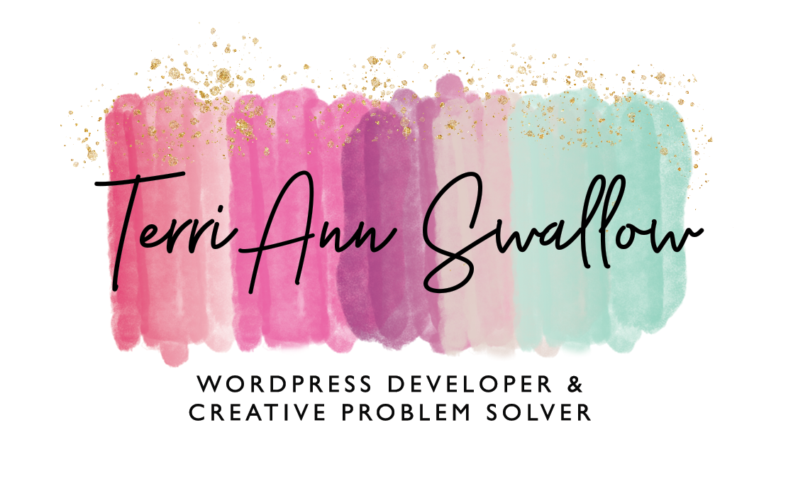
As I mentioned earlier, the glyphs panel in Photoshop (open via Window > Glyphs) is also a great way to see an overview of decorative font characters available. The font I’m using had an “extra” version with graphic elements that compliment the characters in the typeface.

The polished finished version of the logo, which includes additional kerning and leading adjustments in addition to the ligature and alternate characters.
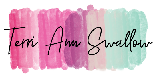
Use the slider below to compare the subtle differences between the two treatments.


